Portfolio Details
Odio et unde deleniti. Deserunt numquam exercitationem. Officiis quo odio sint voluptas consequatur ut a odio voluptatem. Sit dolorum debitis veritatis natus dolores. Quasi ratione sint. Sit quaerat ipsum dolorem.
Project information
- Category: Brochure / Collateral
- Client: Synature / US Surgical
- Project URL: www.covidien.com
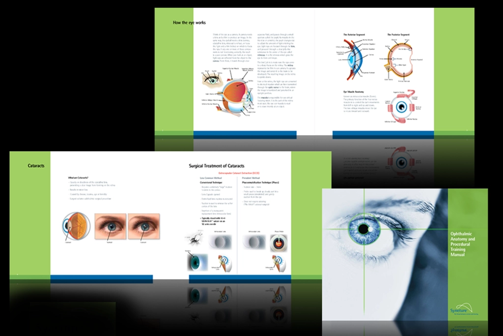
Case Study: Syneture — “Ophthalmic Anatomy & Procedural Training Manual” (Interior Pages)
Role: Designer/ Illustrator
Project Type:Medical Education / Technical Illustration
Goal: Create clear, accurate, visually structured educational materials that help medical trainees understand eye anatomy and cataract procedures.
Project Overview
This conceptual training manual presents complex ophthalmic anatomy and surgical procedures in a clean, structured layout. The design uses diagrams, labeled illustrations, and a medical grade color palette to support clarity and learning for ophthalmic trainees.
Problem
Medical training materials often suffer from cluttered layouts or overly dense text. The challenge was to simplify complex anatomical information and surgical steps into a format that is easy to follow, visually organized, and professionally aligned with medical standards.
Solution
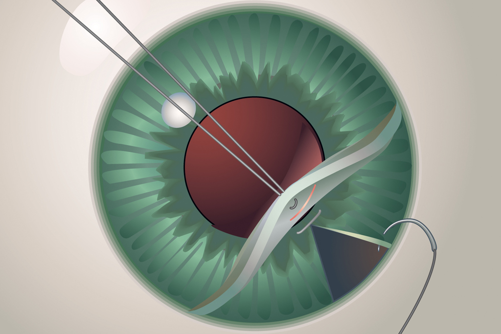
I created a multi section layout featuring labeled diagrams of the eye, including anterior/posterior segments, muscle anatomy, and lens structure. The cataract section uses side by side comparisons and step by step surgical illustrations to clarify ECCE and Phaco techniques. The Syneture branding reinforces trust and medical precision.
Before / After
• Shifted from dense medical text to clean, diagram driven learning
• Used color coding to differentiate anatomical regions
• Added step by step surgical visuals for clarity
• Organized content into digestible sections
• Strengthened brand identity through consistent medical palette and typography
Process
I studied ophthalmic diagrams and surgical workflows to ensure accuracy. The layout was built around clarity: wide margins, clean labels, and consistent iconography. The final design balances technical precision with visual simplicity, making complex content accessible to trainees.
Tools
Photoshop Illustrator
Outcome
The final manual pages deliver a clear, professional educational experience. The combination of diagrams, structured content, and medical branding creates a trustworthy training resource — a standout addition to your microsite’s technical and instructional design category.