Portfolio Details
Odio et unde deleniti. Deserunt numquam exercitationem. Officiis quo odio sint voluptas consequatur ut a odio voluptatem. Sit dolorum debitis veritatis natus dolores. Quasi ratione sint. Sit quaerat ipsum dolorem.

Project information
- Category: Point of Purchase
- Client: Snapple
- Project URL: www.snapple.com
Case Study: Snapple “Natural Resources” — Elemental Brand Ad
Role: Designer
Project Type: Conceptual Beverage Promotional
Goal: Reimagine a legacy Snapple ad into a modern, elemental visual that positions the brand as a refreshing, nature driven beverage experience.
Project Overview
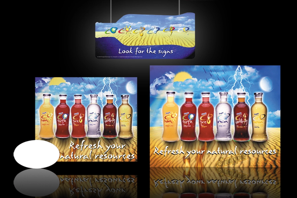
This conceptual ad modernizes Snapple’s classic “Natural Resources” campaign by reframing each flavor as a symbolic element — Sun, Earth, Fire, Rain, Moon. The original surreal landscape is replaced with a cleaner, retro modern composition that highlights the bottles as elemental icons. The goal was to create a premium, contemporary visual that feels fresh, symbolic, and brand forward, while still honoring the playful personality Snapple is known for.
Problem
The original ad relied heavily on early 2000s visual effects — lightning, glowing orbs, heavy gradients, and a crowded surreal background. While nostalgic, the composition lacked modern hierarchy and clarity. The elemental concept was strong, but the execution felt visually noisy.
The challenge was to preserve the elemental storytelling while rebuilding the ad with modern spacing, typography, and illustration.
Solution
I redesigned the ad using a retro modern hybrid style:
• Clean flat vector reinterpretations of the five elements
• Simplified bottle presentation with modern color blocking
• A balanced grid that gives each element room to breathe
• Updated copy that reinforces the “natural resources” theme
• A refined Snapple brand tone that feels premium and intentional
The headline — “Refresh your natural resources.” — remains the emotional anchor, now supported by a cleaner, more contemporary visual system.
Before / After
• Shifted from a surreal, crowded composition to a clean, modern layout
• Replaced heavy gradients with soft, premium color transitions
• Introduced flat vector elemental icons to strengthen the concept
• Simplified bottle presentation for clarity and brand focus
• Modernized typography to create hierarchy and readability
• Strengthened brand alignment through tone, palette, and composition
Process
I began by analyzing the original ad’s strengths — the elemental theme, the bottle lineup, and the playful brand tone. From there, I explored modern beverage advertising references to understand how brands use minimalism, color, and symbolism to communicate flavor.
I rebuilt each element (Sun, Earth, Fire, Rain, Moon) as a flat vector icon, then designed a layout that balances the bottles, the headline, and the elemental system. Typography was refined to feel clean and editorial, while color choices were softened to create a premium, nature inspired palette.
The final composition blends symbolic storytelling with modern beverage aesthetics.
Tools
Photoshop Illustrator
Outcome
The final ad delivers a fresh, symbolic, emotionally driven message that positions Snapple as more than a beverage — it’s a collection of natural elements you can drink. The combination of modern illustration, premium typography, and elemental storytelling creates a memorable visual suitable for a microsite portfolio or brand concept pitch.